Pythonでmatplotlibを使用したグラフ表示のサンプルです。
まずはmatplotlibをインストールします。
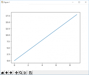
# sample1 1次関数
# 数値計算ライブラリ
import numpy as np
# グラフ表示ライブラリ
import matplotlib.pyplot as plt

# 描画範囲の指定
# (x軸の最小値, x軸の最大値, 刻み)
x = np.arange(0, 10, 1)

# 計算式
y = 2 * x

# 横軸の変数。縦軸の変数。
plt.plot(x, y)

# 描画実行
plt.show()
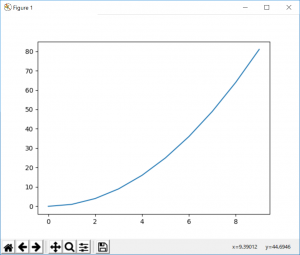
# sample2 2次関数
# 数値計算ライブラリ
import numpy as np
# グラフ表示ライブラリ
import matplotlib.pyplot as plt

# 描画範囲の指定
# (x軸の最小値, x軸の最大値, 刻み)
x = np.arange(0, 10, 1)

# 計算式
y = (x * x ) + 2x +1

# 横軸の変数。縦軸の変数。
plt.plot(x, y)

# 描画実行
plt.show()
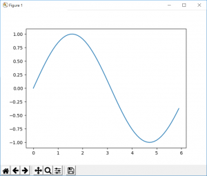
# sample3 log
# 数値計算ライブラリ
import numpy as np
# グラフ表示ライブラリ
import matplotlib.pyplot as plt

# 描画範囲の指定
# (x軸の最小値, x軸の最大値, 刻み)
x = np.arange(0, 6, 0.1)

# 計算式
y = np.sin(x)

# 横軸の変数。縦軸の変数。
plt.plot(x, y)

# 描画実行
plt.show()